
PROJECT:Toe Beanzz ● ROLE: UX designer/researcher ● DURATION: May 2026 (2 weeks)
PROJECT VISION
(Please note: This is an independent conceptual project created for UX portfolio purposes and is not affiliated with any real company or brand.)
The vision of this project is to create a seamless, intuitive mobile experience for Toe Beanzz that supports both fast-paced, frequent users and casual visitors. At its core, the redesign focuses on simplifying the ordering and gift card system so users can complete everyday actions, like purchasing drinks, managing balances, and sending gift cards—without unnecessary friction or confusion. By addressing key pain points such as fragmented gift card balances, limited payment flexibility, and unclear navigation, the experience aims to feel more unified, efficient, and user-friendly.
Beyond functionality, the project also envisions Toe Beanzz as a more connected and community-driven space. For frequent users like Mia, the app prioritizes speed, efficiency, and smart wallet management to support busy schedules. For occasional users like Jorge, it emphasizes clarity, accessibility, and meaningful social features like digital gift card gifting. Overall, the goal is to design an experience that feels effortless for all users while strengthening the emotional connection between customers and the Toe Beanzz brand.
CHALLENGES
Designing a gift card system that supports multiple use cases, including frequent users who want to combine balances and occasional users who want to send gifts to others.
Reducing checkout friction while still maintaining clarity around multiple payment methods and gift card balances.
Creating an interface that balances speed and simplicity for power users like Mia with accessibility and clarity for low-frequency users like Jorge.
Addressing cluttered or fragmented gift card management without overwhelming users with too many financial details or complex wallet structures.
KICKOFF
The project kickoff began as a solo effort where I established the foundation for the Toe Beanzz mobile experience by defining the core problem space around gift card management and mobile ordering. I clarified project goals focused on reducing checkout friction, improving wallet organization, and supporting both frequent and occasional users. I also identified the primary and secondary personas, Mia and Jorge, to ensure the design addressed both high-frequency transactional needs and low-frequency social use cases like gifting.
From there, I outlined key assumptions, constraints, and initial success metrics to guide the direction of the design process, including faster checkout times, reduced gift card confusion, and improved usability for all user types. I also mapped out a research and exploration plan centered on user pain points such as fragmented balances, limited payment flexibility, and the lack of a digital gifting option. This early phase helped create a clear structure and intentional focus for the remainder of the UX process, from research through iteration and solution design.
➤ “What problem am I truly trying to solve?”
➤ “Who am I designing this experience for?”
➤ “Why does this solution matter to users?”
➤ “Where do the biggest user pain points exist?”
➤ “When does this experience break down for users?”
➤ “Which assumptions need to be tested first?”
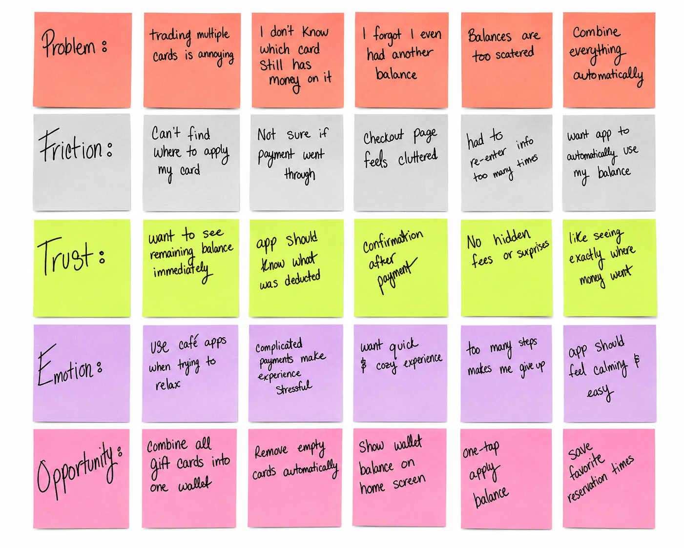
After the kickoff, I synthesized the initial research findings for the Toe Beanzz app into affinity maps to organize patterns around gift card management, checkout friction, and user experience gaps for both frequent and occasional users. This helped surface key themes such as fragmented gift card balances, limited payment flexibility, and the lack of a digital gifting option, allowing me to clearly define the core problem areas impacting users like Mia and Jorge.
From there, I explored early solution directions through ideation and low-fidelity flows, translating these insights into potential features such as a unified gift card wallet, multi-card payment functionality, and a dedicated gift card sending feature. This iterative process allowed me to stay closely aligned with user needs while testing different approaches to streamline ordering and improve accessibility, before narrowing in on the most effective solutions for the final design direction.
MEET THE USERS
PRIMARY
Name: Mia
Age: 33
Occupation: Nurse

Mia is a busy 33-year-old nurse who frequently visits Toe Beanzz during short breaks between shifts because of its convenient location near her workplace. She needs a faster and more organized way to manage her gift cards within the app, but the current experience makes checkout frustrating by limiting how gift cards can be stored, combined, and used during purchases.
“Between long shifts, I just want to grab my coffee quickly without dealing with multiple gift cards and a confusing checkout process.”
Name: Jorge
Age: 62
Occupation: Retired
SECONDARY
Jorge is a 62-year-old retiree who visits Toe Beanzz to relax, pet the cats, and socialize with friends in a welcoming community environment. He needs a simple and intuitive way to occasionally place orders and manage payments when he chooses to purchase items, but the current experience feels overly complex for low-frequency users. He is also interested in buying digital gift cards to send to his friends as small gestures of appreciation, but the app does not support this feature, limiting his ability to share thoughtful gifts conveniently.
“I enjoy coming here to relax and spend time with friends, but I wish it was easier to send digital gift cards and keep things simple when I do need to make a purchase.”
COMPETITIVE ANALYSIS
Some direct and indirect competitors for Toe Beanzz include KitTea, Lady Dinah's Cat Emporium, The Brooklyn Cat Cafe, and The Farmer's Cat Cafe. These businesses were identified because they offer similar experiences involving coffee, themed café environments, cat interactions, or digital gift card services that appeal to similar target users as Toe Beanzz.
To research these competitors, I analyzed cat café directories, café business websites, and online gift card systems to better understand how existing businesses structure their user experience and digital services. I focused specifically on features related to gift cards, mobile convenience, customer engagement, and café navigation. For example, businesses like NEKO Cat Café offer digital gift cards and online wallet features, while other cafés emphasize relaxing customer experiences and easy browsing for reservations or purchases. This research helped identify common user pain points and opportunities for Toe Beanzz to improve the experience through simplified gift card management and a more friction-free app design.
KEY DIFFERENCES BETWEEN COMPETITORS
KitTea
Website and digital experience allow users to browse café information, make reservations, and interact with the brand online, similar to how the Toe Beanzz app focuses on creating a convenient and engaging customer experience.
Toe Beanzz focuses more heavily on reducing digital gift card pain points by allowing users to combine balances into one wallet and manage cards more seamlessly within the app.
Lady Dinah's Cat Emporium
Website provides users with streamlined navigation for reservations, events, and café information, which is similar to the organized and user-friendly experience Toe Beanzz aims to provide through its app.
Toe Beanzz expands beyond reservations by integrating digital wallet features and simplified gift card management directly into the app experience.
Brooklyn Cat Cafe
Uses its website to help customers easily access café details, reservations, and online services, similar to Toe Beanzz’s goal of creating an intuitive mobile experience for customers.
Toe Beanzz specifically targets user frustrations involving gift cards by allowing customers to track balances, remove empty cards, and combine funds in one location.
NEKO Cat Cafe
Offers digital gift card purchasing and online customer features that closely align with Toe Beanzz’s app-based café and gift card experience.
Toe Beanzz improves on this experience by designing a more friction-free wallet system that supports combining balances, easier checkout, and gifting digital cards to other patrons directly within the app.
Across Toe Beanzz and its competitors, gift card management is often treated as fragmented and transactional, with users forced to juggle multiple cards, deal with inactive or empty balances, and navigate separate processes for sending gift cards to others. Toe Beanzz addresses these pain points by creating a unified wallet experience that allows users to combine multiple gift card balances into one place, automatically declutters inactive or empty cards, and streamlines the process of purchasing and gifting cards to other patrons. This creates a more organized, flexible, and user-centered system that reduces frustration while enhancing the overall café experience.
PREPARING THE JOURNEY
The design process for the Toe Beanzz gift card redesign began with organizing user research insights into an affinity map. This helped surface recurring pain points such as confusion around multiple gift card balances, difficulty locating stored cards, and frustration with limited usability at checkout. By grouping similar comments together, clear patterns emerged that guided the direction of the redesign and helped define key opportunity areas.
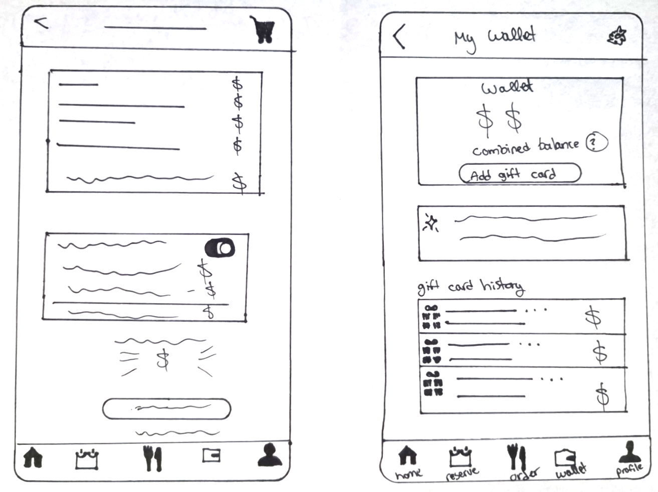
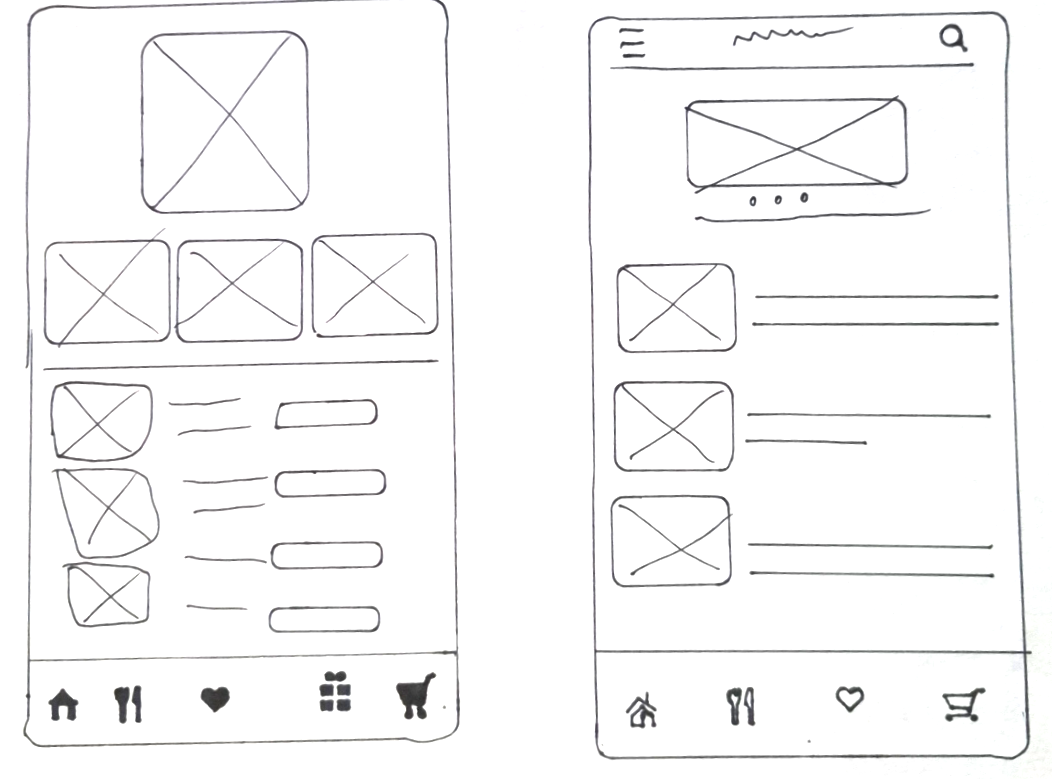
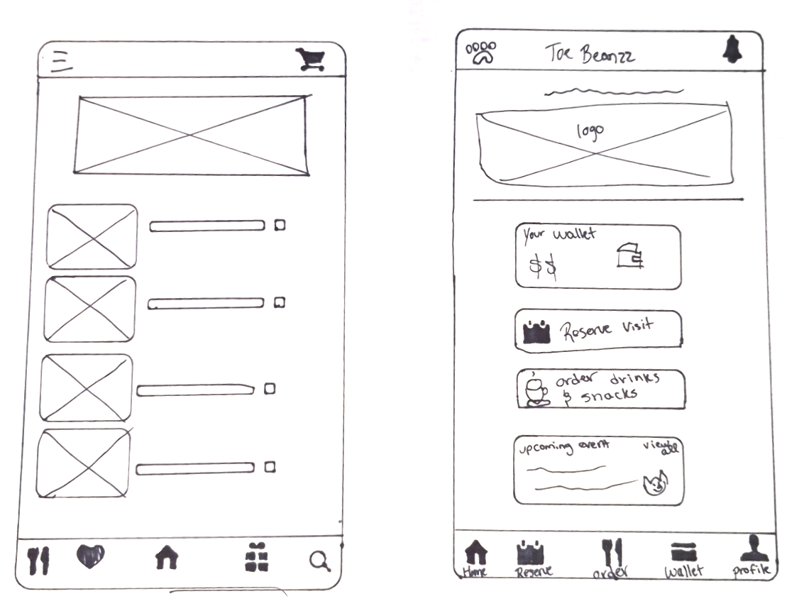
From there, I moved into paper wireframes to quickly explore different layouts and flow ideas without committing to a single solution. This stage allowed for fast iteration on how users might store, view, and apply gift cards in a more intuitive way, focusing on simplicity and reduced cognitive load.
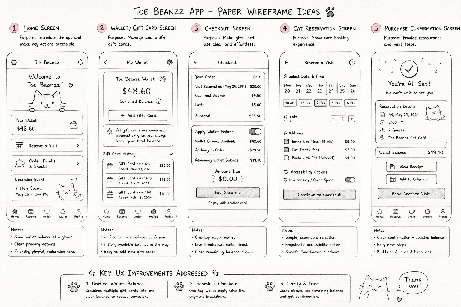
These concepts were then translated into digital wireframes, where the structure and hierarchy were refined for usability and clarity. At this stage, I focused on creating a more cohesive wallet experience, improving navigation between gift cards, and ensuring the checkout flow made applying multiple balances feel seamless and straightforward.
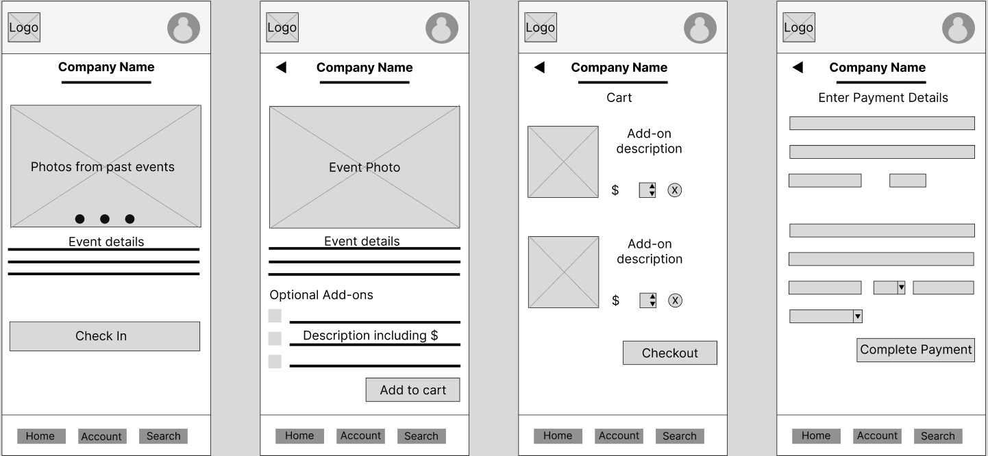
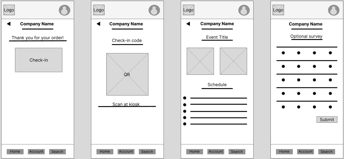
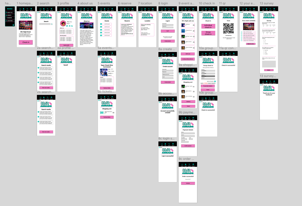
After testing the prototype with five participants across task-based scenarios, several consistent usability issues emerged that informed the next iteration of the design:
Confusing navigation
Participants struggled to understand where to go next, often hesitating or backtracking due to unclear navigation pathways.

Too many unnecessary steps and elements
Participants noted that excessive icons, pages, and steps made the experience feel cluttered and more complicated than necessary.
No group check-in option
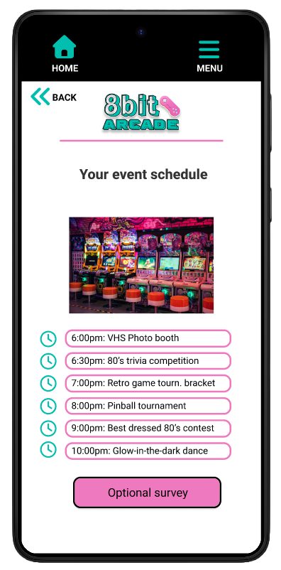
Users expressed frustration that there was no way to check in multiple attendees at once, making the process feel inefficient for group arrivals.

Lack of action confirmation
Testers were unsure if key actions (like adding items or completing check-in) were successful due to minimal or unclear feedback.

Challenge 1:
Balancing Simplicity with Functionality
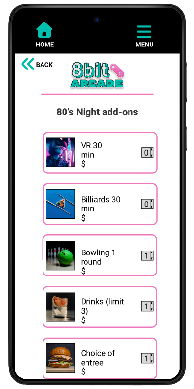
One challenge during the design process was creating an interface that included all essential event and check-in features without overwhelming users with too much information at once. Through multiple design iterations, I reduced visual clutter by simplifying layouts, limiting unnecessary elements, and improving spacing and hierarchy to better guide user attention. I also refined the color contrast and placement of the primary CTA buttons so users could quickly identify the next step in the flow.
Challenge 2:
Designing a Low-Stress Self-Service Check-In Experience
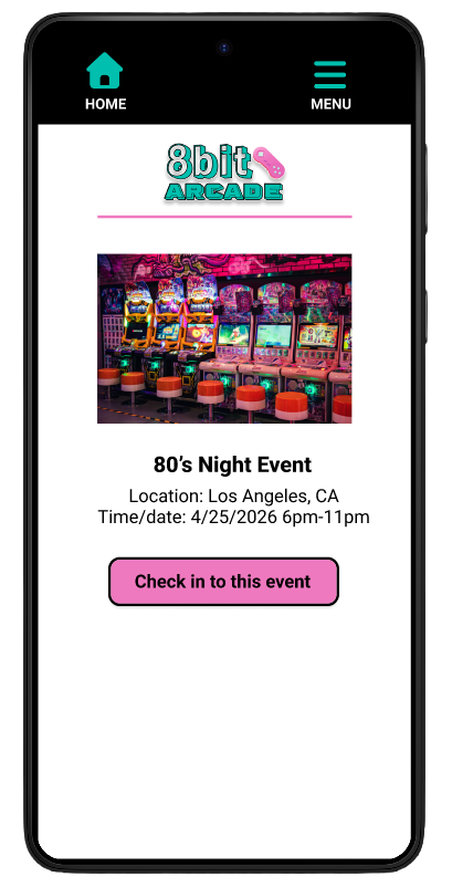
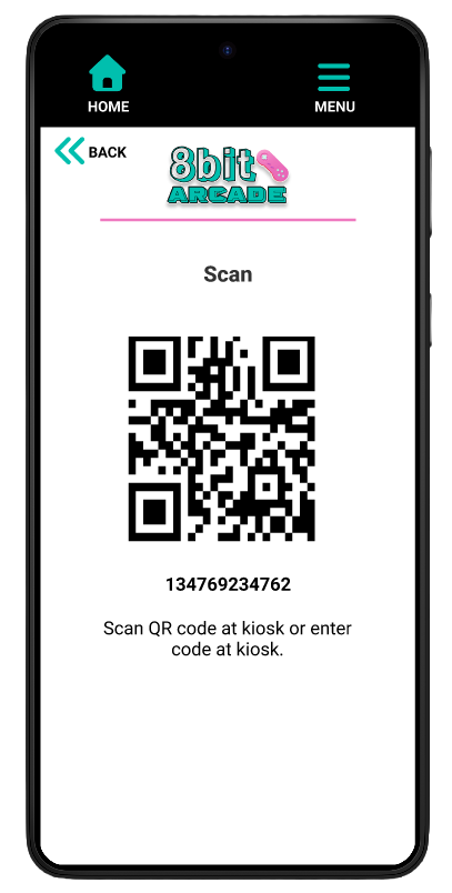
A key challenge was designing a check-in flow that felt comfortable and low-pressure for users who prefer minimal human interaction in crowded event spaces. To address this, I iterated the design to create a clear, step-by-step self-service experience with intuitive navigation, scannable QR code access, and concise instructions that reduced uncertainty and helped users move through the process independently.
Challenge 3:
Optimizing for Mobile Usability and Quick Interactions
Designing for mobile required carefully balancing readability, accessibility, and speed so users could complete tasks quickly while navigating busy event environments. Through iterative testing and refinement, I improved button sizing, spacing, typography hierarchy, and screen flow to create a more intuitive experience that supported fast interactions and reduced cognitive load on smaller screens.
Challenge 4:
Maintaining Accessibility Within a Bold Visual Style
A major design challenge was balancing the app’s bold, neon-inspired arcade aesthetic with accessibility and readability standards. Throughout the iteration process, I adjusted contrast levels, refined typography choices, simplified background elements, and used consistent visual hierarchy to ensure important information and interactive elements remained easy to identify without losing the energetic visual identity of the brand.
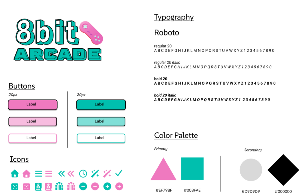
STYLE GUIDE
MOCKUP PROTOTYPE
Video of mockup.
TAKEAWAYS
This project strengthened my understanding of how thoughtful UX design can create experiences that are both visually engaging and highly accessible. Through user research, usability testing, and iterative design improvements, I learned how to balance a bold visual identity with clear navigation, readability, and low-stress interactions for users in fast-paced environments. Designing 8bit Arcade reinforced the importance of user-centered decision making at every stage of the process and further developed my skills in mobile-first design, accessibility, prototyping, and translating user pain points into an intuitive digital experience.
Be sure to check out the process for 8bit Arcade’s creation below.